Colorful Home Decor Ideas to Brighten Small Rooms Today
Cassandras ShopUpdated on: April 7, 2026
Transform your living spaces with vibrant and dynamic decorative elements that bring personality and warmth to every room. Colorful home decor creates an inviting atmosphere that reflects individual style while enhancing mood and comfort. This comprehensive guide explores practical strategies for selecting, combining, and implementing bright design choices that elevate your interior aesthetic. Discover how to balance bold hues with neutral tones, select complementary color schemes, and invest in pieces that endure trends. Learn expert tips for creating cohesive, visually stunning spaces without overwhelming your environment.
Table of Contents
- Did You Know?
- Comparison: Pros and Cons
- Buyer's Checklist
- Final Thoughts and Advice
- Frequently Asked Questions
- About the Author
Introduction to Vibrant Interior Design
Colorful home decor has evolved from a bold design statement into a mainstream approach for creating personalized living environments. Today's homeowners recognize that strategic use of rich hues, patterns, and textures transforms ordinary spaces into extraordinary reflections of personal identity. Whether you prefer jewel tones, pastels, earth tones, or energetic primary colors, vibrant design choices communicate aesthetic values while improving psychological well-being. Research indicates that thoughtfully implemented color schemes enhance creativity, reduce stress, and increase overall satisfaction with living spaces.
The key to successful implementation lies in understanding color theory, spatial proportions, and the interplay between individual elements. Rather than overwhelming rooms with excessive brightness, effective colorful home decor balances bold accents with neutral foundations. This approach allows statement pieces to shine while maintaining visual harmony and functional comfort throughout your home.
Did You Know?
- Color psychology studies show that warm hues like orange and red stimulate energy and appetite, making them ideal for dining and entertainment spaces.
- Cool colors such as blue and green promote relaxation and focus, perfect for bedrooms and home offices where concentration matters.
- Approximately seventy-five percent of color perception depends on light quality, meaning the same hue appears dramatically different under natural versus artificial lighting.
- Accent walls with bold paint colors can increase perceived room dimensions by up to fifteen percent when strategically placed.
- Decorative accessories featuring multiple vibrant hues cost fifty to seventy percent less than repainting entire rooms, offering budget-friendly design updates.
- Interior design professionals report that homes featuring cohesive, colorful schemes sell faster and achieve higher market values than minimalist alternatives.
- Textile elements including pillows, rugs, and throws account for approximately forty percent of perceived color in typical living rooms.
Comparison: Pros and Cons
Advantages of Colorful Home Decor
- Creates immediate visual interest and personality that reflects individual taste and lifestyle preferences.
- Enhances mood and psychological well-being through color psychology principles and positive environmental associations.
- Defines spaces functionally without requiring architectural changes or expensive renovations.
- Offers flexibility to update aesthetics seasonally or when personal preferences evolve.
- Makes smaller spaces feel more dynamic and prevents institutional or sterile appearances.
- Provides excellent opportunities for mixing vintage, modern, and cultural design elements seamlessly.
- Supports sustainable decorating practices by repurposing existing furniture with colorful accents and accessories.
Disadvantages to Consider
- Requires careful planning to avoid visual chaos or overwhelming sensory experiences in compact spaces.
- Demands knowledge of color coordination to prevent clashing combinations that diminish aesthetic appeal.
- May present challenges when transitioning between rooms if color schemes lack cohesion throughout the home.
- Can appear dated quickly if trends shift, potentially requiring frequent updates and additional investment.
- Necessitates quality lighting assessment since poor illumination undermines color impact and visual harmony.
- May complicate furniture selection when finding pieces that complement multiple dominant hues simultaneously.
- Requires honest self-assessment about maintenance, since vibrant colors show dust and fingerprints more noticeably.

Vibrant textile combinations layered with complementary hues creating dynamic visual depth.
Understanding Color Theory for Home Design
Successful colorful home decor relies on fundamental color theory principles that professional designers apply consistently. The color wheel demonstrates relationships between primary, secondary, and tertiary colors, guiding selection of harmonious combinations. Complementary colors sit opposite on the wheel and create maximum contrast, ideal for accent pieces that demand attention. Analogous colors neighbor each other and produce serene, cohesive environments perfect for bedrooms and relaxation areas.
Saturation and value matter equally to hue selection. Saturation describes color intensity—from muted pastels to vivid jewel tones—while value indicates lightness or darkness. Combining high-saturation colors demands careful balance; incorporating neutral backgrounds and varying values prevents visual exhaustion. Professional interior designers frequently employ the sixty-thirty-ten rule: sixty percent neutral foundation, thirty percent dominant color, and ten percent accent hues. This formula maintains visual interest while ensuring spaces remain functional and comfortable for extended occupancy.
Understanding your home's natural and artificial lighting fundamentally affects color selection success. North-facing rooms receive cool, blue-tinted light that complements jewel tones and cool colors beautifully. South-facing spaces benefit from warm, golden light that enhances warm hues. Artificial lighting varies dramatically; incandescent bulbs cast warm tones while LED options range from cool to warm temperatures. Always test paint samples and large fabric swatches under your actual lighting conditions before making final commitments.
Buyer's Checklist for Colorful Home Decor Selection
Before purchasing colorful home decor items, work through this comprehensive checklist ensuring thoughtful, coordinated investment:
- Assess existing furniture: Photograph current pieces from multiple angles and under different lighting to identify dominant colors, materials, and styles that new items must coordinate with.
- Determine color palette: Select two to three dominant colors plus two accent hues maximum, ensuring they complement your existing furnishings and architectural elements.
- Evaluate lighting conditions: Test colors under both natural daylight and artificial lighting at different times, documenting which combinations perform best in your specific environment.
- Measure spaces accurately: Record room dimensions, doorway widths, and wall areas to ensure new decor items fit proportionally without overcrowding or appearing insignificant.
- Consider maintenance requirements: Identify which fabrics require dry cleaning, which paint finishes resist staining, and what materials suit your household's activity level realistically.
- Research durability: Invest in quality materials that resist fading from sunlight and maintain color vibrancy through regular cleaning cycles.
- Plan budget allocation: Designate spending for statement pieces, supporting accessories, and flexible elements that allow future updates without complete redesigns.
- Sample before committing: Purchase small quantities, rent furniture when possible, and utilize reversible options like removable wallpaper and throw pillows initially.
- Verify return policies: Confirm retailers accept returns on items purchased after in-home testing, protecting your investment against unexpected incompatibilities.
- Document inspiration: Create mood boards combining paint swatches, fabric samples, and photographs establishing your vision before purchasing full-scale items.
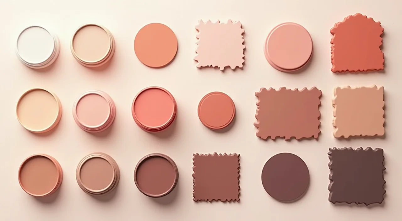
Coordinated color swatches and material samples organized by complementary hue families.
Practical Implementation Strategies
Transforming inspiration into functional, beautiful spaces requires strategic planning and measured execution. Start by addressing architectural elements: paint, flooring, and permanent fixtures form your design foundation. Choosing neutral wall colors—soft whites, warm grays, or subtle beiges—allows colorful accessories to dominate without overwhelming the space. This approach provides flexibility since you can update accent pieces seasonally without repainting.
Textiles offer the most versatile avenue for incorporating vibrant hues. Quality area rugs anchor furniture arrangements while introducing multiple colors simultaneously. Throw pillows, blankets, and curtains layer colors while remaining easily changeable. Consider investing in a statement sofa upholstered in a solid jewel tone, then surrounding it with neutral seating pieces that allow colorful accessories to shine. This balance prevents any single color from dominating excessively.
Artwork and decorative accessories deserve careful curation. Rather than purchasing randomly, select pieces that reference your chosen color palette while introducing visual interest through varied scales, mediums, and cultural influences. Consider ceramic accent pieces that combine artistic beauty with functional lighting, adding dimension and personality to shelves and nightstands. Lighting fixtures themselves become design elements when featuring colored glass or hand-painted finishes.
Plants introduce organic color variation that softens rigid design schemes. Foliage greens complement virtually any color palette, while flowering plants provide seasonal updates. Living walls featuring trailing vines or small potted arrangements create dynamic focal points requiring minimal additional decorating investment.
Final Thoughts and Advice
Creating successful colorful home decor requires confidence in personal preferences balanced with design principles ensuring visual harmony. Avoid trends demanding complete room overhauls; instead, invest in timeless pieces featuring complementary hues that transcend seasonal variations. Quality matters more than quantity; fewer, well-selected items create more refined results than overcrowded spaces filled with budget alternatives.
Remember that color preferences evolve naturally over time. Design your spaces with flexibility in mind, selecting furniture and architectural elements in neutral tones while reserving vibrant expression for easily changeable accessories. This approach allows your home to grow with you without requiring expensive renovations when aesthetic preferences shift.
Trust your instincts while remaining educated about color relationships and spatial design principles. Visit homes and design showrooms featuring colors you admire, documenting combinations that resonate emotionally. When color choices reflect authentic preferences rather than pursued trends, your spaces naturally feel comfortable, personal, and welcoming. Start small with accent pieces, assess results honestly, then expand your colorful vision gradually as confidence increases.
Frequently Asked Questions
How do I prevent colorful decor from appearing chaotic or overwhelming?
Apply the sixty-thirty-ten color rule consistently: maintain sixty percent neutral backgrounds, limit dominant colors to thirty percent of visible space, and use accent hues for approximately ten percent maximum. Balance saturated colors with muted tones, incorporate varying scales of patterned elements, and ensure adequate negative space prevents visual exhaustion. Test your color combinations under actual lighting before full implementation.
Can colorful home decor work in small spaces?
Absolutely. Strategic use of vibrant colors actually makes compact spaces feel larger and more dynamic. Use light, saturated colors on walls to create airiness, employ accent walls featuring deeper hues to add dimensionality, and keep larger furniture pieces neutral while introducing color through accessories. Avoid covering all surfaces with bold patterns; instead, concentrate colorful elements in specific zones creating focal points.
What is the best approach for coordinating colorful decor when moving between rooms?
Establish a consistent color palette throughout your home using two to three recurring hues appearing in different proportions across spaces. This creates visual flow while allowing room-specific variations reflecting function and lighting conditions. Transitions between rooms feel natural when color intensity gradually shifts rather than abruptly changes. Consider using complementary accent colors in different rooms rather than identical schemes, maintaining cohesion while expressing individuality per space.
How often should I update colorful decor elements?
Update accessories seasonally or whenever inspiration strikes, keeping your home feeling fresh without requiring structural changes. Rotate textiles, rearrange artwork, and swap accent pieces every few months to maintain visual interest. Reserve architectural changes like paint and flooring for every five to ten years, selecting timeless colors that support multiple accessory combinations throughout ownership.
Where can I find quality colorful decor pieces that coordinate with my existing furniture?
Explore specialty retailers offering curated collections featuring coordinated color palettes, vintage markets providing unique character pieces, and online platforms allowing detailed filtering by color and style. Consider artisanal ceramic lighting fixtures combining handcrafted quality with vibrant finishes. Local art galleries and craft fairs often feature one-of-a-kind pieces adding authentic personality while supporting independent artists. Online communities and design forums provide personalized recommendations based on specific room characteristics and aesthetic preferences.
Should I incorporate colorful decor in professional home offices or neutral workspaces?
Yes, strategically. Research confirms that moderate color in work environments enhances creativity and reduces monotony-related fatigue. Incorporate calming blues and greens promoting focus, or warm terracottas and golds stimulating energy without overwhelming concentration. Use colorful accessories and artwork rather than dominant wall colors, maintaining professional appearance while supporting cognitive function and worker satisfaction.
About the Author
Cassandras Shop Interior Design Specialist
I am a passionate advocate for personalized interior design who believes every home deserves to reflect the unique character and preferences of its inhabitants. With years of experience guiding clients through color selection, spatial planning, and accessory curation, I have witnessed firsthand how thoughtful design choices transform spaces into cherished environments. My expertise spans residential design across multiple styles, from bohemian eclecticism to contemporary minimalism with colorful accents. I genuinely enjoy helping others discover confidence in their aesthetic choices while applying proven design principles ensuring beautiful, functional results. Explore my recommendations for quality colorful home decor pieces and implementation strategies tailored to your specific circumstances. Remember, your home should bring you joy every single day—let's create that together through informed, creative design decisions.