

Chic Home Accents That Elevate Everyday Spaces
Cassandras ShopUpdated on: 2026-10-23
Chic home accents help you create a polished look without overhauling your entire space. When selected with intention, they add warmth, balance, and personality to everyday rooms. The right mix of texture, color, and scale can make even small areas feel intentional. This guide offers practical strategies you can use immediately to refine your styling decisions.
Pros & Cons of Chic Home Accents
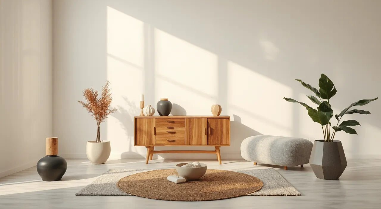
Chic home accents are small to medium decor items that elevate the visual quality of a room. They can range from textiles and trays to wall pieces, table styling, and decorative lighting. Used well, they create a designer finish that feels cohesive rather than cluttered.
- Pros: They deliver high impact with relatively low cost compared to large renovations.
- Pros: They allow seasonal updates without replacing furniture.
- Pros: They help define a room’s style through color harmony, texture contrast, and purposeful placement.
- Pros: They can improve function, such as when decorative storage doubles as display.
- Cons: Over-accumulation can lead to visual noise and a cluttered look.
- Cons: Poor color matching can disrupt the mood and make spaces feel inconsistent.
- Cons: Incorrect scale can make accents look too small, too large, or disconnected from the surrounding furniture.
When you approach styling as a system, these disadvantages become manageable. The goal is not to add more items. The goal is to add better structure.
Step-by-Step Practical Guide
Start With a Visual Brief
Before you shop or rearrange, define what “chic” means for your home. A visual brief is a simple checklist that keeps decisions consistent. Begin by choosing one style direction, such as modern minimal, warm classic, coastal calm, or refined boho.
Then decide three constraints:
- Palette: Select two primary tones and one accent tone.
- Texture direction: Choose whether you want more softness (linen, knits) or more structure (ceramic, metal, glass).
- Room mood: Determine whether the area should feel airy, grounded, bright, or cozy.
This step prevents random purchases and helps you reach a unified result faster.

Color palette swatches, fabric samples, and layout blocks
Choose Color and Texture First
Color and texture create the foundation. Many homes look “almost styled” because accents are chosen without a consistent sensory theme. Start with color harmony, then deepen the look with texture.
How to pick a palette that reads as chic:
- Limit dominant colors to a small range. Neutral bases often include beige, cream, taupe, light gray, or warm white.
- Add one accent color through smaller items, such as a vase, a cushion cover, or a framed print.
- Repeat colors at least twice so the eye can track continuity from one surface to another.
How to layer texture without overdoing it:
- Combine at least two textures: for example, smooth ceramic with soft textiles.
- Use contrast in finishes. Matte surfaces balance glossy ones well.
- Choose one “hero” texture that stands out, while the others support it.
When color and texture are aligned, the rest of your styling feels intentional.
Match Scale and Layout
Scale determines whether chic home accents look refined or misplaced. A common issue is choosing visually interesting items that do not fit the dimensions of your surfaces.
Apply these scale rules:
- Height checks: For shelves and consoles, include pieces that vary in height, rather than matching everything to one level.
- Visual grouping: Style in small clusters of two to five items, depending on surface size.
- Leave space: Negative space is part of the design. Crowding reduces the “gallery” effect.
Layout also matters. Place larger accents at anchor points, such as corners, ends of consoles, and focal areas behind chairs. Smaller pieces should support those anchors, not compete with them.
Layer Lighting and Focal Points
Lighting is one of the most powerful tools for creating a chic home accent style. Even well-chosen decor can appear flat under harsh overhead lighting. A layered lighting approach adds depth and improves the way colors appear throughout the day.
Use a simple three-part system:
- Ambient light: Your primary source, such as a ceiling fixture.
- Task light: Lighting for reading, working, or grooming areas.
- Accent light: Warm, directional lighting that highlights surfaces and creates cozy shadows.
For accent lighting, look for options that create a soft glow rather than a harsh beam. Warm tones generally read more welcoming and upscale. If you want a subtle decorative element, decorative night-time lighting can also function as a visual accent in the evening.
One example style choice is pairing a refined decorative night light with your bedside textiles. If you already enjoy coastal or nature-inspired design, consider browsing decorative lighting options such as barn owl ceramic night light to see how thematic detail can still feel elegant when the rest of your palette stays consistent.
Soft glow lights, shadow shapes, and balanced decor
Create Styling Rhythm
Chic styling is not only about what you add. It is also about how your accents move across the room. Rhythm guides the viewer through the space and makes your decor feel curated.
Three practical rhythm methods:
- Repeat materials: If you choose ceramic accents, include ceramic in two or three places. If you choose woven textures, repeat the weave in at least one other item.
- Use a pattern of sizes: Alternate larger and smaller items within a cluster. This creates balance and prevents monotony.
- Balance visual weight: Heavy-looking elements should be countered with lighter elements or open space.
When you are unsure, simplify. A smaller number of well-matched accents will read more “designer” than a larger collection that lacks connection.
Avoid Common Mistakes
Even strong design ideas can fail when a few predictable errors occur. Use this checklist to protect your results.
- Do not chase too many themes: Two themes at most per room. More than that often causes confusion.
- Do not ignore negative space: Surfaces need breathing room. Leave part of the tabletop or shelf visible.
- Do not mix too many accent colors: Select one accent color strategy, then repeat it.
- Do not overlook scale consistency: If you use tall decor in one corner, balance it with tall decor elsewhere or keep other corners flatter.
- Do not forget function: If an item is purely decorative but obstructs daily use, replace it with something both beautiful and practical.
If you want to explore lighting or decorative elements that can support a cohesive style, pay attention to how an item’s color and finish interacts with your existing palette. For example, nature-inspired pieces often work well when you keep surrounding tones neutral and allow one accent color to carry the mood.
Additionally, you may enjoy brand updates and curated merchandise through LoG Merchandise Store while refining your personal aesthetic. Treat it as inspiration, not a substitute for your room’s measured palette.
Wrap-Up
Chic home accents elevate your space by creating cohesion, balance, and visual clarity. Start with a simple visual brief, choose a limited palette, and layer textures that complement one another. Then apply scale and layout rules so each item earns its place. Finally, use lighting to bring warmth and depth to your styling.
When you follow these steps, your home will feel more intentional and easier to maintain. Focus on fewer, better-aligned accents, and your rooms will show a polished finish that lasts beyond seasonal trends.
Q&A Section
How many chic home accents should be visible in one room?
There is no single number that applies to every space. Use a practical guideline: aim for clusters rather than constant coverage. If your surfaces feel calm and the eye can rest between items, you have enough. If you notice crowding, reduce item count or increase negative space on shelves and tables.
What is the easiest way to choose colors for home accents?
Start with the colors already present in your room. Pick two dominant tones and one accent tone that matches your goal mood. Then repeat the accent tone at least twice so it becomes a pattern instead of a one-off decision.
Do decorative night lights count as chic home accents?
Yes, decorative night lights can function as chic home accents when they support the room palette and lighting goals. Look for finishes that harmonize with other materials in your home. Choose designs that create a soft glow rather than a harsh light and place them where they enhance bedtime or evening ambiance.
How do I make accent pieces look coordinated without matching everything?
Coordination does not require identical items. Use shared design signals such as the same finish family, similar color temperature, or repeating textures. When you repeat one or two attributes across different pieces, the room reads as cohesive even if the shapes vary.
About the Author
Cassandras Shop
Cassandras Shop is a home styling resource focused on helping readers create refined, approachable interiors through thoughtful decor selection. With expertise in decor curation and visual harmony, Cassandras Shop emphasizes practical guidance that supports both aesthetics and everyday function. The goal is simple: transform your space with intentional details that feel timeless. Thank you for reading, and enjoy styling with confidence.
The content in this blog post is intended for general information purposes only. It should not be considered as professional, medical, or legal advice. For specific guidance related to your situation, please consult a qualified professional. The store does not assume responsibility for any decisions made based on this information.


