Bright Kitchen Decor Ideas That Feel Fresh Year-Round
Cassandras ShopUpdated on: 2026-07-17
Color has a direct effect on mood, focus, and how spacious a kitchen feels. This guide explains how to plan colorful kitchen decorations using a practical layering approach. You will learn how to choose palettes, place accents, and balance bold finishes with everyday function. You will also find durable material ideas and quick refresh methods for every budget.
Introduction
Colorful kitchen decorations can transform a room that is often designed for function into a space that feels welcoming, personal, and visually organized. When you choose color intentionally, you can reduce visual clutter, highlight key zones such as cooking and dining, and make daily routines more enjoyable. The most effective designs do not rely on random accents. Instead, they use a controlled plan for palette selection, material choice, and placement.
Whether your kitchen is bright and modern or warm and traditional, you can add character without sacrificing practicality. The approach in this article focuses on repeatable methods. You will learn how to build a cohesive look with textiles, wall elements, tabletop items, and lighting accents. You will also find guidance on how to keep the result balanced, easy to maintain, and aligned with your home’s existing finishes.
Practical Guide
Plan your color system before you shop
Start with a short planning step. Choose one primary color, one secondary color, and one neutral that supports them. Neutrals can include white, cream, beige, gray, or wood tones. This structure prevents the common problem of having many colors that do not visually connect.
Then consider where color will appear most often in your daily line of sight: countertops, backsplash area, open shelving, and the dining corner. If you want a strong visual statement, concentrate your strongest color in one or two zones. For a quieter effect, distribute small accents across multiple areas.
Finally, decide your finish level. Matte and soft textures often make color feel calm. Glossy finishes can increase brightness but may emphasize smudges. This decision helps you match your aesthetic to your maintenance preferences.
Use layered accents for depth, not noise
A layered approach creates a designed look even when you use simple items. Think in three tiers. The first tier sets the tone with larger surfaces such as wall color, curtains, or cabinet hardware. The second tier adds shape with mid-sized pieces such as dish towels, runners, or small framed art. The third tier provides the finishing touch through compact accents like canisters, serving trays, or decorative containers.
When every tier competes for attention, the kitchen can feel busy. Instead, keep your third tier lighter in tone and allow your second tier to carry most of the color identity. This strategy supports a cohesive visual rhythm.
Turn walls and open shelving into a controlled gallery
Walls are often the easiest place to introduce color without disrupting functionality. You can use removable options such as framed prints, adhesive wall art, or a small gallery wall. If you prefer a softer look, choose textiles such as curtains or valances that introduce color through vertical lines.
For open shelving, keep containers consistent in shape. Color variation still works, but uniform forms reduce visual chaos. You can also arrange items by height to create a stable composition. For example, taller pieces at the back, medium items in the middle, and compact items in front.
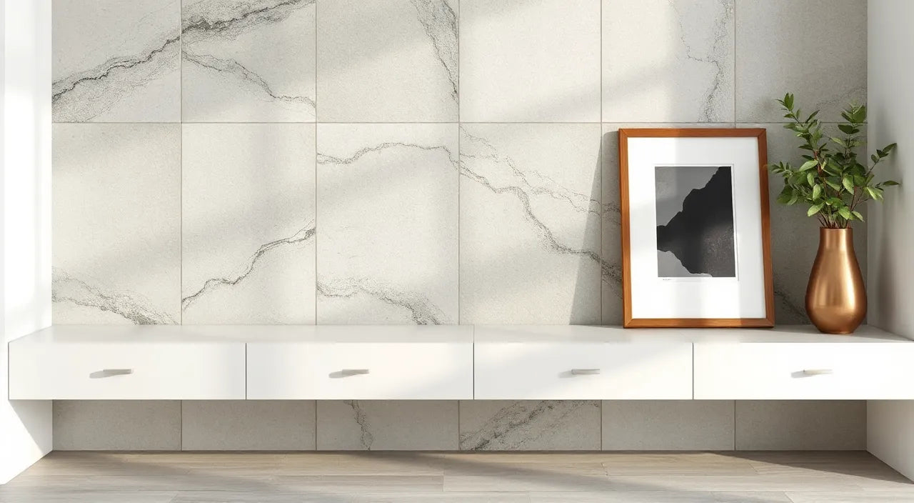
Color palette tiles, shelf heights, and framed prints
Choose textiles that create contrast and comfort
Textiles are a practical way to introduce seasonal style. Kitchen towels, placemats, and runners can be swapped quickly, which supports experimentation. Choose fabrics that perform in everyday use. Cotton is breathable and easy to wash. Microfiber can help reduce streaks on glass and stainless surfaces when you use it appropriately.
For contrast, match warm textiles with cooler kitchen finishes, or use cooler colors to balance warm wood tones. If your kitchen has strong natural light, saturated colors can look vivid. In dim areas, leaning toward medium-saturation shades often provides a more flattering result.
One detail that matters: repeat colors across at least two textile categories. If you use a teal towel, consider bringing teal into a placemat edge, a runner pattern, or a small accent item. Repetition increases cohesion.
Add personality to the tabletop without increasing clutter
Tabletop decorations should enhance organization rather than create extra surfaces to manage. Choose functional décor: canisters for dry goods, trays for frequently used items, and utensil holders that match your palette. Decorative pieces should also be easy to reposition when you cook or host.
If your kitchen includes a dining table, coordinate tableware colors with your kitchen palette. A consistent tone across placemats, napkins, and serving bowls creates a seamless look. Keep patterns intentional. Use one patterned element and balance it with solid items in the same color family.
When you are uncertain, adopt the “two dominant tones” rule. One tone can be the background (such as cream or light gray), and the second tone can carry the decoration. Then allow small accents in third and fourth shades only if they match.
Use lighting to amplify color safely
Lighting can change how color appears. Warm lighting can soften bright shades, while cooler lighting can make colors look crisp and high contrast. If your kitchen has overhead lighting that creates harsh shadows, add low-level accents such as under-cabinet lights or small decorative lamps.
Consider using decorative light sources that complement your color scheme. Small lighting accents can create a focal point near counters or dining areas, especially during evening use. This method also supports the “third tier” finishing effect discussed earlier.
For an additional design layer, coordinate lighting color with your textiles. If you use warm-toned fabrics, choose warmer lighting temperatures or fixtures that cast a softer glow. This helps your colorful kitchen decorations feel intentional rather than artificial.

Layered light glow, color swatches, and shadow patterns
Prioritize easy maintenance and durable materials
Colorful décor should remain attractive after frequent cleaning. Choose washable textiles and wipeable surfaces. For wall art, consider moisture-resistant finishes in kitchens that experience steam or splashes. If you place decorations near heat sources, select items that can handle frequent exposure to gentle warmth.
For décor that sits near cooking stations, avoid overly delicate textures. Instead, choose materials that tolerate regular wipe-down routines. A consistent cleaning habit prevents discoloration, which is especially important for darker shades.
You can also reduce wear by rotating decorative textiles. Keep a small set of matching towels and change them seasonally. Rotation extends the life of your most vibrant pieces and preserves their saturation.
Key Advantages
Improves mood and perceived warmth through intentional color choice.
Creates visual structure that helps separate work zones and dining areas.
Makes daily routines feel more engaging by adding personality to functional spaces.
Supports flexible updates because textiles and small accents are easy to refresh.
Enhances styling consistency by using a repeatable palette and layering method.
Summary & Next Steps
Colorful kitchen decorations work best when they follow a clear plan: choose a palette, apply layered accents, and prioritize durability. Begin with one zone, such as open shelving or the dining corner. Add textiles to introduce comfort, then finish with controlled tabletop and lighting details. If you want an immediate upgrade, swap one textile set and add one wall or shelf element that repeats your chosen tones.
If you would like inspiration for a coordinated kitchen theme, you can explore options from Barn Owl night light to see how decorative lighting can support a warm, styled atmosphere. For a nature-inspired palette direction, also consider Bluefin tuna night light or Blue Jay night light. Use these as references for color harmony and accent placement, then adapt the idea to your own kitchen décor system.
Take one step today: select your primary and secondary colors, then list three places you want color to appear. Build from there and keep the result balanced. A designed kitchen is not about having more décor; it is about creating purposeful color connections.
Q&A Section
What colors work best for a small kitchen?
In smaller kitchens, medium saturation and light-reflecting neutrals usually provide the best balance. Choose one stronger color for accents and keep the supporting tones lighter. Using fewer dominant colors also reduces visual noise, which helps the room feel open.
How can I add colorful accents without making the kitchen look messy?
Focus on repeatability. Keep container shapes consistent on open shelves and repeat the same color family across at least two categories such as textiles and tabletop items. Use trays and vertical organization to define where items belong. When decoration is tied to storage, the kitchen stays visually clean.
Where should I place the strongest color to get the most impact?
Choose a single focal zone, such as a wall section behind dining seating or an organized shelf. Apply your most saturated color there and support it with lighter accents elsewhere. This method guides the eye and prevents competing highlights across the entire room.
Are patterned textiles or solid colors better for coordinating a palette?
Both work well, but coordination matters. Solid colors make it easier to maintain visual calm. Patterned textiles can add energy, but they should use colors that already exist in your palette. If you choose a patterned item, balance it with solid pieces that match the dominant tones.
About the Author
Cassandras Shop
Cassandras Shop is a home décor-focused brand with expertise in curating color-forward, practical accents for everyday spaces. The team focuses on styling principles such as palette harmony, durable materials, and functional beauty. Thanks for reading, and may your kitchen feel more vibrant, organized, and distinctly yours.
Disclaimer: This article provides general design guidance and styling ideas. Results depend on your kitchen layout, lighting conditions, and existing materials. Always follow manufacturer care instructions for any textiles or décor items.
The content in this blog post is intended for general information purposes only. It should not be considered as professional, medical, or legal advice. For specific guidance related to your situation, please consult a qualified professional. The store does not assume responsibility for any decisions made based on this information.